A strong PowerPoint presentation is designed to close down the debate rather than opening it up. In most of the business presentations, PowerPoint slideshows have become the criteria for visuals. They are effective to inject visual interest into the PPT, simple to update and easy to produce.
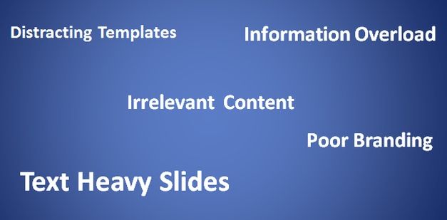
Each and every day, thousands of innocent employees and clients are bored to tears by the presentations that should be considered an offense against humanity. The key to success is to make sure that your slide show is not a visual distraction, just a visual aid. Below is a list of the five deadly sins that can ruin your PowerPoint presentation.

Distracting Presentation Templates
No doubt, presentation templates often contain poor color combinations and distracting backgrounds. So, avoid distractions and concentrate on getting your message across, even if it means using a basic layout for your presentation slides.
Relevance of Content
Before you make a PowerPoint presentation, know the size of your audience, screen and room. Also, pick a clearly readable font which is large enough for the prospective decision maker at the back of the room to read. Moreover, do ensure to keep your slide backgrounds clean and simple.
Text Heavy Slides
For providing an overview or depicting an idea graphically, slides are an excellent medium. Try to avoid complete sentences, quotations and paragraphs. Do not use your slides as speaker notes since audience will only be able to digest key points. So, limit your slides to 3-4 phrases to make your point.
Information Overload
PowerPoint presentations are supposed to support what you are saying; it is not to convey the whole story. Otherwise, why would people listen to you? In order to pick the significant points on the screen, use the outline of your presentation. However, if you are going over a difficult document then provide your audience with the handout to which they can refer.
Poor Branding
When you are competing for attention, using a template which is at odds with your corporate branding will make it difficult for people to remember who presented what. Therefore, it is highly recommended to ensure that that fonts, layout, design and colours used in your presentation have come from your own enterprise.
Presentations are supposed to be interesting and easy to grasp, make sure your presentation is not something that ruins somebody’s day but rather an interesting mix of informative and persuasive slides.


