Free Charts PowerPoint Templates
Download free charts for PowerPoint presentations and slide designs with data charts, including different chart themes like bar chart templates with gradient colors, pie charts, donut charts and line chart designs for PowerPoint presentations.
Advertisement
PowerPoint chart templates can elevate your presentations, making data visualization engaging and understandable. Whether you’re presenting business metrics, KPIs, research findings, or sales trends, a visually appealing chart can make a significant difference. Here’s how you can make the most of them:
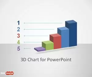
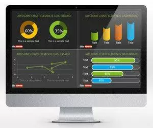
- Bar Charts: Ideal for comparing quantities across categories. We offer bar chart templates with gradient colors, 3D effects, and more.
- Pie Charts: Perfect for showcasing parts of a whole. Discover our range from simple slices to intricate multi-level designs.
- Donut Charts: A twist on the pie chart, donut charts allow for a central focus, such as a percentage or number. Our editable donut chart templates can help to present the information in a clear and convenient way.
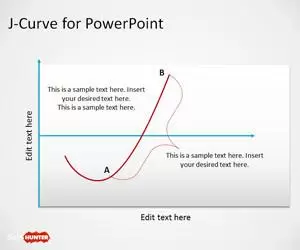
- Line Charts: Track changes over periods and visualize trends with our sleek line chart designs. Use line charts in presentation reports and dashboards.
- Area Charts: Represent quantities through color-filled areas. Excellent for understanding growth or decline over time. Use editable area charts in your PowerPoint slides.
- Stacked Charts: Compare multiple data series without clutter. Great for showcasing parts-to-whole relationships across categories. You can download stacked chart slides for PowerPoint here.
- Column Charts: Dive into comparisons of discrete categories, using vertical bars of varying lengths.
- Scatter Plots: Explore relationships between two variables in a visually compelling way.
Dive into our extensive collection of editable & free Chart templates for PowerPoint and choose the perfect design to narrate your data story effectively.