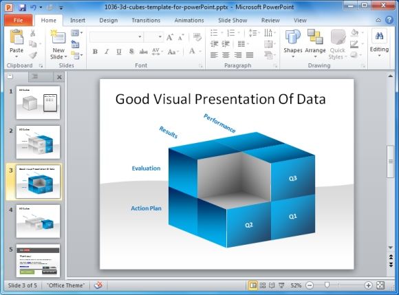
Presenting the sales scenario of your company or any other vital graphs and data, requires not only a verbally convincing tone, but also appropriate strategy for displaying your ideas. Most presenters confuse it with the standard way of demonstrating their ideas. There is a considerable difference in the manner of Presentation of Data, than the customary way of exhibiting your ideas and concepts.

Here are five tips for giving a good visual presentation of data:
1. Put A Proper Headline For Each Slide
When presenting the graphs make certain that you have selected a proper title for each slide. It is better to put the inference drawn or the conclusion in the heading, so that the audience have an idea of what is being discussed. However, a good presenter knows how to maintain the suspense and will not reveal the whole story in the title itself.
2. Clearly Mention The Assumptions And Readings
Don’t expect the audience to do the calculations or search out the final interpretations from your data. If you have put it in black and white for them to read and distinguish at the first go, there will be minimal chances of misinterpretation.
3. Using Images Makes The Information Clearer And Understandable
Use distinctive images which are more closely related to the type of data you are demonstrating. Selection of the type of graphs is also a crucial job, it should blend with the type of information you are sharing. Hence, whether it should be a pie-chart, bar graph or line graph is at your disposition but a decision to be taken with intellect. You can make use of various readymade PowerPoint Templates for this purpose, like this Free 3D Cubes PowerPoint Template or these PowerPoint Slide Designs.
4. More Numbers And Graphics Rather Than Words
Don’t make it a lengthy document when it is meant to be a presentation with lesser content. Digits will serve the purpose but avoid cramming it with too much of information. Keep something for yourself to speak as well. This will also prevent the ill-habit of reading from the slides. Remember, you are trying to tell a story with data and analytics.
5. Proper Flow Of Information
Spread the information in separate slides so that it flows like a story; and there are connecting points the audience is able to identify with. If you keep reading from the slides you will make it boring and the more of a distraction.
If you are the expert with stats and data then ensure that you are able to make your listeners fall in love with it too. The easier you make it for them to understand and identify with; the more they will appreciate your efforts.


