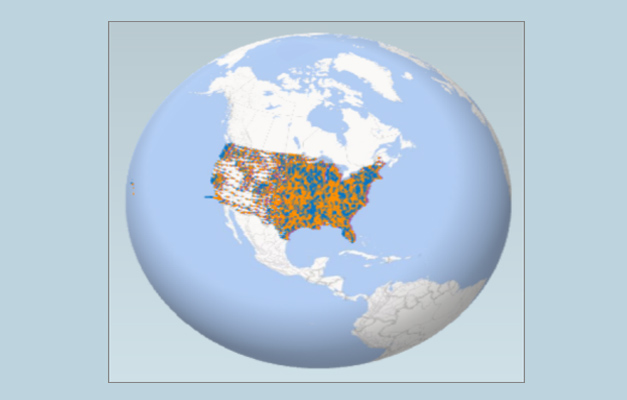
Power Map for MS Excel is a 3-dimensional data visualization tool that allows you to view the information in a different way. This wonderful tool by Microsoft allows you to have three dimensional view and discover insights that you might not be able to see with the two-dimensional charts & tables.

Installing Microsoft Power Map Excel Add-in
Power Map is a free MS Excel add-in that can be easily installed from the Microsoft Download Center. You require MS Office Professional Plus, Office 365 ProPlus to successfully install Power Map Excel add-in. If you have a Microsoft Office subscription, then you have access to Power Map for Excel as part of the self-service business intelligence tools. In addition, if any of the new Power Map performance enhancements and features is added, you will get them as a part of your subscription plan.
Getting Started with Power Map for Excel
This wonderful add-in of MS Excel offers interactive, three dimensional view of the data enabling you to discover and share insights from data through 3-D visualization, giving more clear and comprehensive data look as compared to the 2D charts and graphs.
If you have excel data that consists of geographic properties in a table format like columns and rows having names of towns, cities, states, countries, etc, following are some steps on how to get started:
- Firstly, open the workbook that contains the data model or table you need to explore in Power Map
- Now, click on any of the cell in that specific table
- Then, you need to click Insert -> Map. When you click on map for the first time, Power Map gets enabled automatically
By making use of Bing and depending on geographic properties, Microsoft Power Map geocodes your data. After sometime, you will find that a globe appears next to the first screen of the Layer Pane. Now, you should authenticate that the fields are mapped appropriately. If you find that the fields are mapped incorrectly, then click on the drop-down in order to match them to the accurate geographic properties.
You will observe that dots appear on the globe when Power Map plots the data. Now, click on Next to begin aggregating and visualizing your data on the map in a 3D visualization and create an interactive, guided cinematic tours to discover new insights by seeing your data in geographic space.
Go to Download Power Map Add-in for Excel


