Charts in PowerPoint can be enhanced and customized to match your PPT design template, for example if you want to insert a chart over a dark color you may want to change the chart label colors to a light one. Here we will show you how to change the chart labels to any other color.
For this example, we start downloading the free Call Center PowerPoint template, and then we will add a simple chart in PowerPoint.

When you add the chart, the default color used for the labels is black, unless you have a custom color theme in your PowerPoint template.
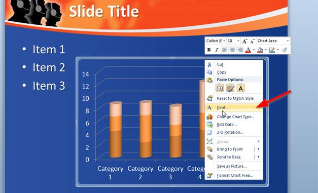
To change the label colors for this chart, right click over the chart and then choose Font.

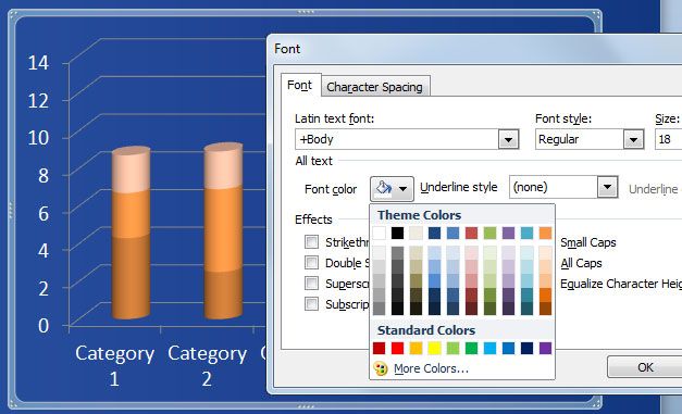
NOw, click on Font color to open the color picker and then click on the white color. This will change the label color for the entire chart.


