Whenever a visitor stumbles upon your B2B website, they immediately find themselves at a crossroad. Where will they turn, or will they maybe stop exploring and head back, away from your site? It all depends on the traffic signs you place in front of them.
Everything, from the first impression to the loading speed of your site, will influence the visitor’s decision to continue engaging (and perhaps ultimately purchase your offer) or abandon ship within mere seconds and start looking elsewhere.
Nowadays, B2B websites are much more than just simple web brochures. They’re more of a window into your business to practically demonstrate your products and services, as well as to welcome potential clients, with an end goal to close more deals.
That is why your website needs to have a professional-looking design, to look attractive and inviting, and to be easy to use. Keep reading to find out more about the best homepage design strategies for successful B2B websites.
Design for Your Target Audience
Your goal is to create a trustworthy and reliable business website that’s designed for a very specific audience – other businesses.
Spend some time and do a little bit of digging to learn more about your target audience and their needs. Which industries do your target customers/clients belong to? What are their typical pain points, and what are the best ways to appease this group or groups?
In this phase, it’s advisable to put aside your personal preferences and put yourself in your customers’ shoes. What do they want to see from your website – or better yet, what answers and reassurances do they need to compel them to do business with you?
Don’t forget to take a look over at your competition, but don’t let that lead you to a spiraling habit of copying ideas.
After some comprehensive research, you’ll be ready to proceed to the next step – designing a successful web homepage.
Double Down on Credible Social Proof
Presenting credible social proof is a vital segment of every B2B website.
Social proof is what will instill confidence and trust in your prospects, which is key if you want them to make a purchase and, eventually, build loyalty.
That’s why you need to place these elements on clearly visible spots across your homepage where they won’t interfere with the main spotlight of your business concept.
A simple, effective, and widely used way for displaying credible social proof on a B2B website is by integrating recognizable logos and brief testimonials of well-known satisfied clients.
Providing actionable information about your business over empty bragging is a much better way to attract and retain clients. They would love to learn that some of the top companies in the industry worked with you.
For example, Affinda, a company that provides AI solutions, lets everyone who visits their homepage learn that their services are trusted by world-renowned companies by showcasing their logos right under the headline.
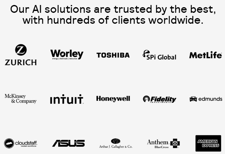
Source: Affinda.com
The homepage of Kopi Luwak Direct is a great example of how to properly display customer testimonials. Displaying testimonials that not only praise but also describe the quality and functionality of your products or services will go a long way toward increasing your conversion rates.
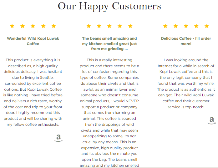
Source: KopiLuwakDirect.com
Give Your Company a Relatable Face
Speaking of trust, decision-makers are skilled in combing through your website and testing the trustworthiness of your brand to see if you’re a reliable partner worthy of doing business with.
Building trust is а long-term process that needs to be carefully considered. There are a few simple steps that you should take in order to show that your business is much more than a cold cash register for collecting money.
Make it clear that your business is helpful, attentive, friendly, and has a team of human experts operating in the background.
- Show a human face on your homepage. Here, we’re not speaking of a random model or a stock image but of faces that represent your business – your team.
Why is this step so necessary? Because you can find it in everyday situations. With companies whose representatives have a friendly and sincere look, the chances that clients will be willing to do business are much bigger than if the representatives put on a cold, fake, or arrogant face.
- Address your site visitors with an authentic and straightforward voice. Overwhelming your prospects is an effective way to drive them away, so keep your homepage simple and easy to understand.
- Demonstrating interest and care goes a long way as well. As a final step, make your customer service options easily accessible and ensure that the department is highly efficient.
Showcase Your Content Prominently
Now, we come to a point where it’s inevitable to mention the importance of using your homepage to give a glimpse of all that valuable content you offer.
As a B2B company, you can boost your conversions if you restructure your long-form content and market it to other businesses in a shorter, more visually-appealing format.
Long-form articles that are educational and relevant are what offers real value to other businesses’ decision-makers, but they can always find that in your blog posts or other landing pages.
Your homepage needs to point them to that content by showcasing only the most eye-catching bits so that clients know you’re the solution they’re looking for.
Take a look at how MarketBeat does this. You don’t have to go anywhere else to find their latest and most prominent content. It’s right on the first loading screen of their homepage.
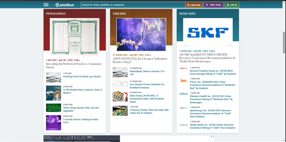
Source: MarketBeat.com
Feature Several Conversion CTAs
An essential part of your B2B website are CTAs – design elements that are there to encourage visitors to perform an action.
Regardless of whether it is “buy now,” “sign up for free,” “free trial,” or whatever works best for your niche, CTAs are a must-have on your homepage because they urge customers to act, ultimately pointing them to the path to purchase. That’s why not featuring enough CTAs means plenty of missed conversion opportunities.
So, pick a prominent position on your homepage, like the top right-hand corner or the middle of the page, and add a simple and inviting CTA. In fact, don’t be afraid to show several CTAs.
Here, you can see how Aura uses three different CTAs on its homepage, increasing the chances for clicks as users browse the homepage.
Source: Goaura.com
Wrapping Up
A great homepage is important for your website and your company, and it can be very effective in positively stimulating your buyers’ decision-making process. By following and implementing the strategies suggested in this article, you can present your business in the best light to potential clients, ultimately opening the doors to growth.