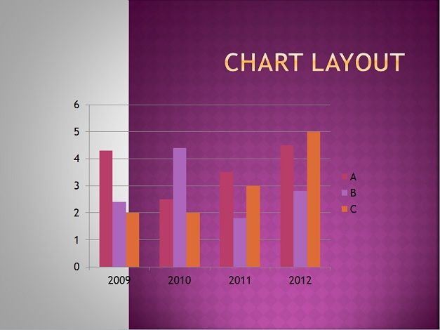
PowerPoint provides a Chart layout tool that is used to communicate data graphically. Displaying charts in PowerPoint allows your audience to see the meaning behind the numbers, and they make showing comparisons and trends a lot easier. Learn use of chart layouts in PowerPoint, so that you can communicate your information effectively.
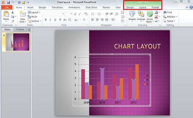
To get option of toolbar, click on the chart in the display field to get new toolbar options.
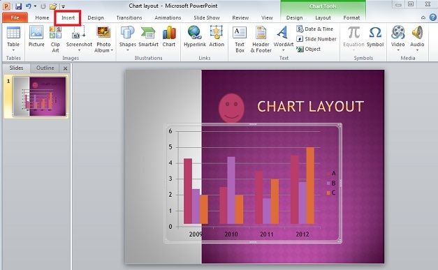
Click on ‘Layout’ Tab, and there are more options. There are option other than Chart Tools options like ‘Insert’, ‘Label’, ‘Axes’, ‘Background’, and ‘Analysis’ options. User can insert pictures from computer, put shapes of different sorts on the image, and a text box on the active PowerPoint chart with ‘insert’ option. Whatever is inserted is simply put over the chart and within the borders of the selected chart.
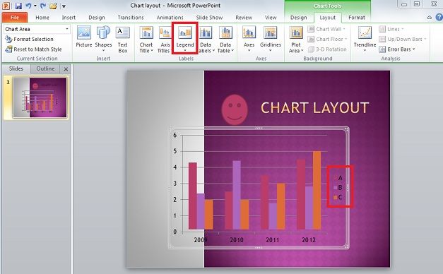
With the ‘Label’ subheading, user can define and shape the chart layout beyond what is allowed with PowerPoint’s link with Excel and the headings provided from that. ‘Label’ options allow displaying actual numerical data that the selected PowerPoint chart is based on, although it could become cluttered with the extra text. For instance, select ‘Show Legend at Right’ from ‘Legend’ on the subtitle and it will place the legend to the right of the chart and change the layout in the process.
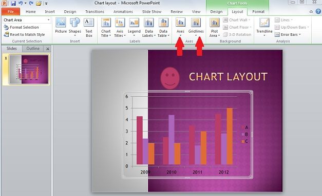
In the Axes group, click the axis or gridline option that you want, it will change the text’s format, location, and alter/add text boxes according to your requirements. ‘Axes ‘will edit vertical or horizontal axis of chart. While ‘Gridlines’ add minor and/or major gridlines along the horizontal and vertical axis.
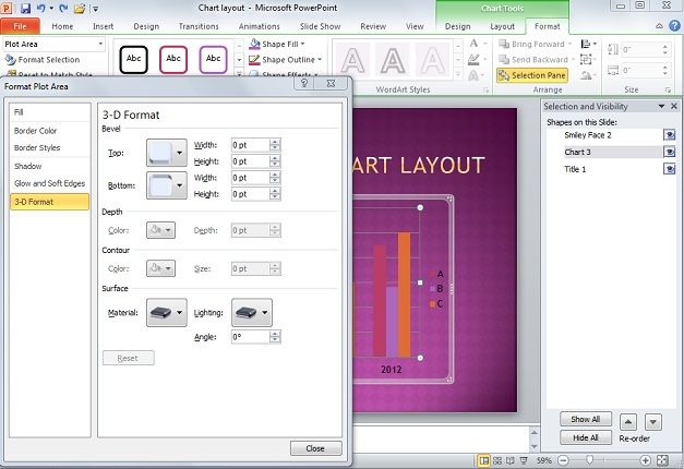
Similarly, in Background group, click the layout option that you want. Remember that the layout options that you select are applied to the element that you have selected. With ‘Design’ option, you can change the active chart’s design to 3D for example. Under ‘File’ select the series you want to edit and edit the 3D nature of. Once this is done, click on ‘Format Selection’ and go to ‘Format Plot Area’ and select ‘3-D Format’.
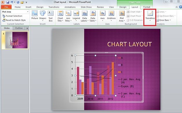
‘Trend Lines’ option allows putting trend lines, lines, up/down bars, etc. to show progress and regression as shown by the bars, basically. It’s available with 2D bars and seems better used for non-stacked charts.
Note that certain selections and editing features under Chart Tools are available depending on what design you choose for your chart. If you would like to use a feature unavailable to you simply use Chart Layout’s ‘Design’ tab to the left of ‘Layout’. The most often used chart designs have a 2D and 3D version and if one does not work, the other will work.