In PowerPoint presentations, Analyzing chart data involves utilizing data obtained from research and representing it using PowerPoint features, such as charts and tables. Analyzing quantitative data usually involves examining the results and identifying patterns and trends. Chart analysis shows the distance between high and low points as well as make predictions on increase and decreasing values over a period.
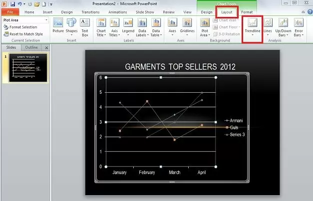
Use a 2D bar or line chart for analysis. Click on ‘Layout’ from ‘Chart Tools’ and click on ‘Trend Lines’. Trend Lines show the trend of a series over a period. ‘Linear Trend line’, ‘Exponential Trend line’, and ‘Linear Forecast Trend line’ tend to show the natural progression from a certain point.

The above image shows the ‘Exponential Trend line’ which is great for when values rise and fall at significant amounts. Below image shows ‘Two Period Moving Average’ which is very different from the other three in the list, it more closely follows the highs and lows indicated in the chart for a series.

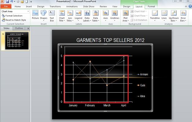
The ‘Lines’ section, is the easiest way of analysis from the Analysis Tools. Drop Lines goes from the top most points of the chart to the very bottom value. In the image below, it goes from the line containing the ‘Idea’ values and down to 0, the bottom most value.
‘Up-down Bars’ simply show the different in value’s data points between the first and last series. In image below, the first and last series entered in the Microsoft Excel data were ‘Armani and Idea’. So the bars shown in white indicate the differences at points between these two.

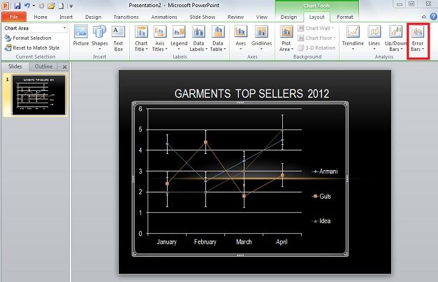
Error Bars under Analysis section show errors for a certain series depending on certain criteria and equations.
All of these tools have their own options to change their appearance such as color or outline. Note that, the ‘Analysis Tools’are appropriate for 2D line and bar graphs. These tools work best for charts with multiple series and significant growth/decline over different periods.