Poster presentations are widely used in academic and professional circles, offering a platform to showcase research, ideas, and innovations. PowerPoint, as a presentation design tool, can be used for crafting the engaging and informative poster presentations. This guide walks you through the process of creating a standout poster presentation in PowerPoint, from scratch and using a compelling poster presentation template to save time.
The goal of a poster presentation is to communicate complex information in an accessible and visually appealing manner. It’s about making a strong impact with a combination of visuals and succinct text, grabbing the attention of your audience and conveying your message effectively.
Planning Your Poster Presentation
Creating a compelling poster presentation begins with thorough and strategic planning. Here’s a step-by-step guide to help you plan a winning poster presentation:
- Define Your Objective: Clearly identify what you want to achieve with your poster. Are you aiming to inform, persuade, or present research findings? Understanding your objective will guide every aspect of your presentation.
- Know Your Audience: Tailor your content to the interests and knowledge level of your audience. Consider what they already know, what they need to know, and how your topic is relevant to them.
- Select a Central Theme or Question: Your poster should revolve around a central theme or research question. This focus will keep your content cohesive and ensure that your audience can easily grasp the main message.
- Gather and Organize Your Information: Collect all the necessary data, research findings, and supporting information. Organize this information logically, grouping related data together. This step is crucial for a structured and coherent presentation.
- Outline Your Content: Create a rough outline of your poster. Decide on the sections you’ll include, such as introduction, methods, results, discussion, and conclusion. This outline will serve as a blueprint for your poster.
- Decide on Key Points: Identify the key points that you want your audience to remember. These should be clear, concise, and impactful. They will act as the main takeaways from your presentation.
- Plan Your Visuals: Think about the visuals that will accompany your text. These could include charts, graphs, images, or diagrams. Visuals should complement and enhance your message, not overshadow it.
- Storyboard Your Poster: Create a storyboard or sketch of your poster layout. This visual representation will help you see how all the elements of your poster will come together. It’s also useful for identifying areas that might need more work or content adjustments.
- Seek Feedback: Before you start designing your poster in PowerPoint, get feedback on your plan. Discuss your ideas with peers, mentors, or advisors. Constructive feedback at this stage can save time and improve the quality of your final presentation.
- Finalize Your Plan: Based on the feedback and your storyboard, finalize the plan for your poster. Ensure that you have a clear structure, compelling content, and a plan for effective visuals.
By following these steps, you’ll be well-prepared to create a poster presentation that is not only visually appealing but also effectively communicates your message. Planning is the foundation upon which a successful poster presentation is built.
Designing Your Poster in PowerPoint
Choose a poster template that suits your content and audience. There are plenty of premium & free poster presentation templates for PowerPoint, Google Slides and Canva presentations.
Pay attention to the layout and size, ensuring it guides the viewer through your content logically. Select color schemes and fonts that enhance readability and attract attention, and incorporate relevant visuals like charts, graphs, and images to support your message.
Choosing the Poster Presentation Size
Poster presentations come in various sizes, and the choice often depends on the guidelines provided by the conference, University or event where the poster will be presented. However, there are some commonly used sizes for poster presentations. Here are a few popular ones:
- A0 Size:
- Dimensions: 841mm x 1189mm (approximately 33.1 inches x 46.8 inches).
- Orientation: Typically vertical (portrait) but can be horizontal (landscape) as well.
- Commonly used in academic and scientific conferences globally.
- A1 Size:
- Dimensions: 594mm x 841mm (approximately 23.4 inches x 33.1 inches).
- Orientation: Can be both vertical and horizontal.
- Preferred for smaller venues or when less content is being presented.
- A2 Size:
- Dimensions: 420mm x 594mm (approximately 16.5 inches x 23.4 inches).
- Orientation: Both orientations are common.
- Useful for smaller presentations or as supplementary posters.
- A3 Size:
- Dimensions: 297mm x 420mm (approximately 11.7 inches x 16.5 inches).
- Typically used for smaller displays or educational posters.
- 36 x 48 inches:
- A common size in North America.
- Orientation: Usually horizontal, which is suitable for many scientific and research presentations.
- 40 x 60 inches:
- Larger size, offering more space for detailed content.
- Common in professional conferences and trade shows.
- Custom Sizes:
- Some conferences may specify unique dimensions based on their display setups or space limitations.
- Always important to check the specific requirements of the event or conference.
When choosing the poster presentation size, it’s crucial to consider both the amount of content you need to display and the norms of the venue where you’ll be presenting. Additionally, unless the poster will be digital, think about transportability and the ease of navigating the event space with your poster.
Applying the IMRaD Structure for Defining the Content of your Poster Presentation
The IMRaD format, an acronym for Introduction, Methods, Results, and Discussion, is a widely accepted organizational structure for scientific writing and presentations. It provides a clear and logical framework that helps in effectively communicating research findings.
The IMRaD format is highly effective for scientific posters:
- Introduction: Set the stage by presenting your research question or hypothesis.
- Methods: Describe the methodology or approach you used in your research.
- Results: Present your findings, ideally using visual aids like graphs or charts.
- Discussion: Analyze and interpret your results, explaining their significance and implications.
IMRaD can be used for defining the content of your poster presentation.
When defining the content of your presentation, take in mind the following additional recommendations.
- Your title should be catchy but informative, your abstract succinct yet descriptive, and your main content clear and concise.
- Strike a balance between text and visuals, making sure to highlight your main points without overwhelming the viewer.
Types of Poster Presentations (and Real Life Examples)
Poster presentations come in various types, each serving specific purposes and catering to different audiences and settings. Understanding the types of poster presentations and how they are used can help in selecting the most appropriate format for your needs. Here are some common types of poster presentations:
Academic Research Posters
Academic Research Posters are predominantly used in scientific, academic, or educational contexts to present research findings. These posters are a staple at academic conferences, symposiums, and university research days. They typically focus on the IMRaD structure, incorporating elements such as Introduction, Methods, Results, and Discussion. These posters often feature graphs, charts, and data tables to visually represent research data.

Case Study Posters
Case Study Posters are designed to showcase a particular case or instance, often in medical, business, or educational fields. They are frequently utilized at professional conferences to discuss specific cases, treatments, or business scenarios. These posters provide a detailed analysis of a single case, including aspects like patient history, treatment approaches, and outcomes in medical settings.
Project Presentation Posters
Project Presentation Posters outline the details of a project, encompassing objectives, methodologies, and outcomes. They are common in fields such as engineering, computer science, and project management. These posters typically include timelines, project objectives, methodologies, and discuss the final results or product demonstrations, providing a comprehensive overview of a project’s lifecycle.
Informational Poster Presentations
Informational Posters aim to inform or educate about a specific topic or issue. These are seen in public awareness campaigns, museums, and educational institutions. The focus of these posters is on delivering clear and concise information, often employing bullet points, infographics, and simple diagrams for easy understanding.
Promotional Posters
Promotional Posters are used to advertise events, products, or services. Businesses, event organizers, and marketers frequently use these posters. They are designed to be eye-catching and persuasive, often incorporating a call-to-action to motivate the audience to engage with the product, service, or event being promoted.
Instructional Posters
Instructional Posters are designed to provide instructions or guidelines, usually in a step-by-step format. These are commonly used in training environments, workshops, or as safety guides in various industries. The content in these posters is presented in a clear, easy-to-follow manner, often accompanied by diagrams or images to illustrate the instructions.
Interactive Posters
Interactive Posters are intended to engage the audience in a more dynamic way. These are found in educational settings, workshops, and some conferences. They may include features like QR codes, touch elements, or augmented reality components, which encourage viewer participation and offer an interactive experience.
Infographic Poster Presentations
Infographic Posters are designed to visually represent information or data. These posters are used widely in both academic and non-academic settings to simplify complex information. They make heavy use of charts, graphs, and visual data representations, with minimal text, making complex data more accessible and understandable to the audience.

Enhancing Visual Appeal of your Poster Presentation
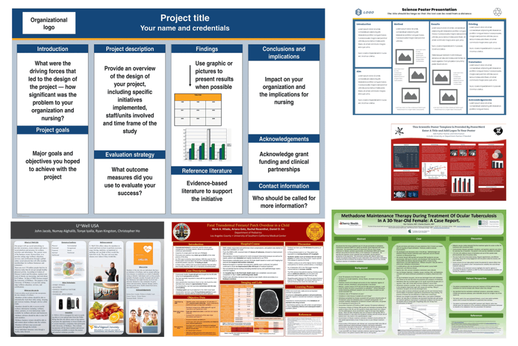
The visual appeal of your poster is crucial in attracting and retaining the attention of your audience. A well-designed poster not only conveys your message effectively but also makes a lasting impression. Here are some examples of poster presentations for different purposes.
Here are detailed ways to enhance the visual appeal of your PowerPoint poster presentation:
1. Choice of Colors in Poster Presentations
- Harmonious Color Schemes: When defining the colors for your poster presentation, select a color scheme that is pleasing to the eye and aligns with your content. Use a color wheel or online tools to find complementary colors.
- Color Psychology: Be aware of the psychological effects of colors. For example, blue can evoke trust and calm, while red can signify energy and urgency. This can be essential depending on the type of poster presentation you are creating.
- Contrast for Readability: Ensure there is sufficient contrast between the background and text colors. High contrast improves readability, especially from a distance. This applies to any kind of poster presentation you are creating.
2. Effective Use of Images and Graphics in Poster Presentations
- Relevant and High-Quality Images: Use images that are directly relevant to the content of your poster presentation. High-resolution images prevent pixelation when enlarged.
- Infographics and Icons: Incorporate infographics in your poster presentations to represent complex data visually. Icons can be used to break up text and highlight key points. SVG graphics are supported in PowerPoint and can help to make pixel-perfect poster presentations (enlarging the graphics without losing quality)
- Balance Between Text and Images: Strike a balance; too many images can be overwhelming, while too few can make your poster text-heavy and dull.
3. Typography in Poster Presentations
- Legible Fonts: Choose fonts that are easy to read in your poster. Sans-serif fonts like Arial or Helvetica are often recommended for posters.
- Font Size and Hierarchy: Use different font sizes to create a hierarchy of information. Titles and headings should be larger to draw attention.
- Consistent Font Use: Limit the number of different fonts to maintain consistency. Usually, two to three different fonts are sufficient.
4. Layout and Composition
- Grids and Alignment: Use grids to align elements symmetrically. Alignment creates a neat, organized look that is easier to follow. Check out the Anatomy of a Poster Presentation to understand what are the key components to include in your poster design.
- Whitespace: Don’t underestimate the power of whitespace (empty space). It helps to avoid clutter and makes your content more digestible.
- Visual Flow: Arrange elements in a way that guides the viewer’s eye through the poster, typically from top left to bottom right. Check out some of the poster presentation examples for inspiration.
5. Interactive Elements in Poster Presentations
While posters are typically static, there are some special touches that you can add to make your poster presentations more dynamic and interactive with the audience.
- QR Codes: Incorporate QR codes to link to additional resources, websites, or full research papers. You can generate a QR code in PowerPoint or use any of the free QR Code generator tools available online.
- Multimedia: If the setting allows, consider adding multimedia elements like short videos or animated charts. Multimedia content is especially useful if you are making a digital poster presentation, and projecting your poster in a TV or screen, instead of using a printed poster.
7. Accessibility Considerations in Poster Presentations
- Color Blindness: For your poster presentation, choose color schemes that are accessible to people with color vision deficiencies.
- Readable Text: Ensure text is large enough in your poster presentation to be readable by individuals with visual impairments.
Review your poster for consistency in style, alignment, and overall visual appeal. Seek feedback from peers or mentors, and be open to making revisions. Finally, consider the practical aspects of printing and setting up your poster for presentation.
Once you are done, engage with your audience by being prepared to explain and discuss your poster, rehearse on the presentation and practice the Q&A session. Be ready to answer questions and participate in discussions. Use this opportunity to network and plan for follow-up interactions.
Conclusion
Creating an effective poster presentation in PowerPoint requires careful planning, design, and execution. By following these guidelines, you can ensure that your poster not only conveys your message effectively but also stands out in a crowd. Embrace the opportunity to showcase your work and make a lasting impression.


