As a presenter, you probably use charts in your presentations. Charts display data in a visual format that audiences can easily grasp. The quality of good chart is that it shows only the data necessary to make the desired point clear – no less, no more. Too much data will overwhelm your audience, blunting your message.
You can make different types of charts in PowerPoint using excel data. For this purpose, open Microsoft PowerPoint and Click the Insert tab, then click on the Chart and new message window Insert Chart will open. Click Bar from menu and then click on Bar Chart and then click OK.
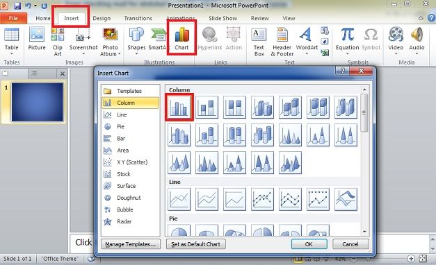
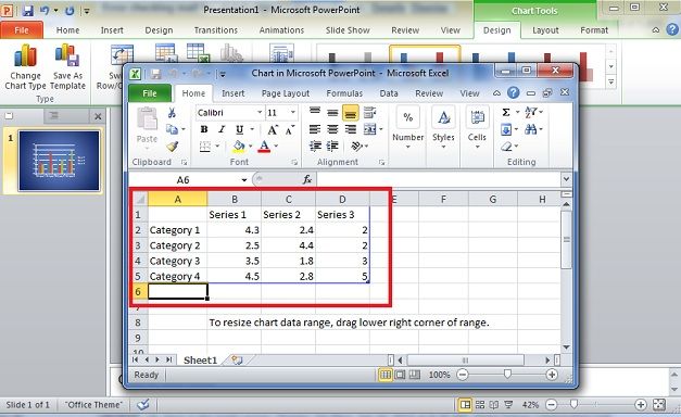
When you click OK, a bar graph appears on PowerPoint slide and a temporary Excel spreadsheet opens, with dummy data.
This Excel sheet is named Chart in Microsoft PowerPoint. Navigate to Excel spreadsheet that contains the data you want for chart, select the data, and copy it to the clipboard. Edit data on temporary spreadsheet as you want, if data is smaller than the dummy data; drag the lower right corner of the blue border inward. The structure and order you input the series data, usually in the columns does not matter, but the order of data in the rows should be in either descending or ascending order.
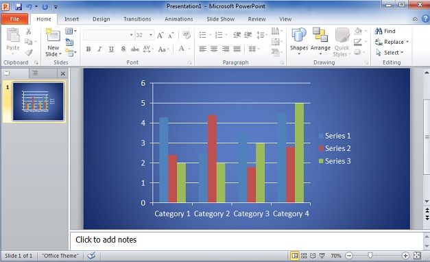
Go back to your PowerPoint slide to see the chart. Remember, some types of charts are suitable for particular types of data; the chart type should match data. For instance, if there is one row of data showing percentages that make up a whole, a pie chart would work better than a column chart.
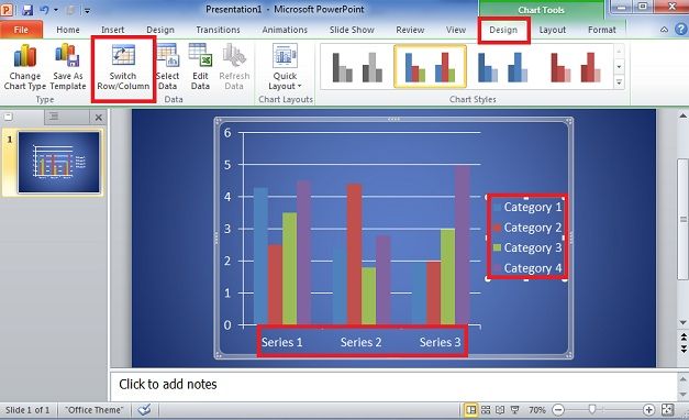
You may want to switch the columns and rows, which you do by clicking the Switch Row/Column button on the Chart Tools Design tab. Here you see the default column chart before and after clicking this button and also adding a slide title.
The Bar Graph in PowerPoint is complete. Edit Excel table data, colors or set a style for your graph according to your requirements; PowerPoint has so many options for formatting charts.
When the chart is done, ask a friend or colleague to look at it. Ask what the chart means. If you get a correct answer, you have succeeded.