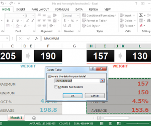
Charts and graphs are a great way of representing your data. Microsoft Excel offers almost every chart type and makes it easier to draw them so that your data can quickly understood in a graphical format. The chart or graph type will depend on the data for which the chart is going to plotted. The most commonly used types include Column Chart, Line Graphs, Pie Chart, Bar Graph, Area Chart, Scatter Graphs, Stock Chart, and Surface Chart, among many others. This article discuss how chart and graph represents data in excel, PowerPoint and their strengths & weaknesses, also the additional functionality that you might not have heard about.
To create a chart in excel, first of all make sure that there is some data in excel sheet and that the excel sheet does not contain any blank cells between the different columns. To get start, make data ready and organized.
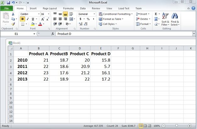
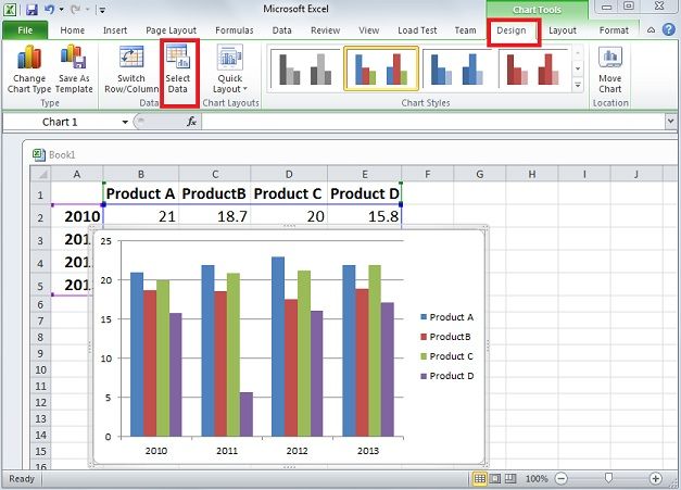
Select the data in the rows with headings, the data with some form of text in the first row. Click the Insert menu and choose the chart type that you want to draw. The data in Excel sheet will be organized as a chart.
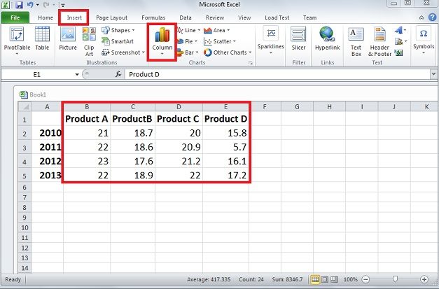
In the drop down, several charts types are available; in this tutorial the 2-D Column chart is used.
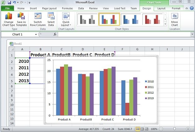
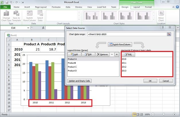
After creating chart in excel, Chart Tools from PowerPoint has appeared. This allows doing all the design tasks from PowerPoint based charts in Excel. Edit the category line beneath the charts. Select chart and click Design, Select Data in this row is visible.
Go to the right box of select data source of new window for categories.
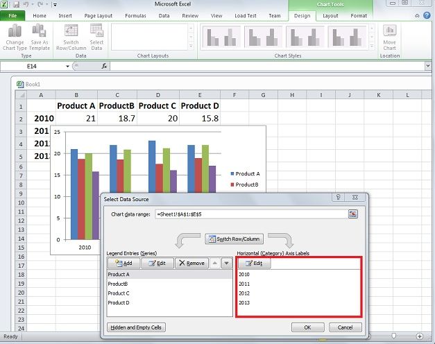
Click edit and add the years sequence or the categories of the chart. Make sure to separate them with commas. Once done, click OK or press Enter.
In the above example chart is created in excel now. Excel is better option for collecting and storing a large amount of stats across number of spreadsheets. A chart in Excel is better when you want to see how data stacks up or for others in a workgroup to see the data. Excel is not good choice for a presentation its graphs and lines, are appropriate for personal work.
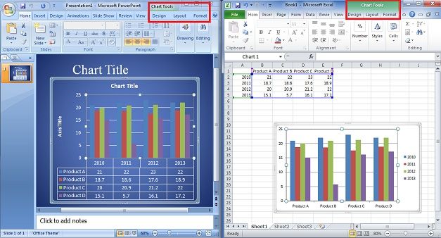
Excel and PowerPoint share some similar features for chart creation, PowerPoint is all about display; background, graphics, sounds, and other things not possible in Excel, even if you are presenting Excel on a projector. Excel is better choice to compile and store stats and date and in tandem with PowerPoint as the origin of data when it comes to creating charts for presentations.